
Obsidian
Obsidian Insurance
Brand Strategy / Brand Rhetoric / Brand Design
A new player in the insurance industry is yet another David among Goliaths, in a field where incumbents make obviously the rule. In the last years though, several players started to disrupt, especially from the insurtech side of the game. Obsidian is not a disruptor through technology; it is an innovatively tailored insurance consultancy with a fresh approach to business.
Innerout delivered brand positioning and strategy, bilingual brand rhetoric for the site and brand materials.
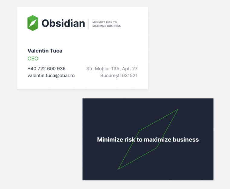
The identity speaks about competent guidance in the insurance clutter. It is about clarity, insightfulness, direction and relevant decisions. The compass inside the “O”, the powerful typo that perfects the visual story, all linked to the brand promise of maximizing business by minimizing risk.



ASKO
ASKO – the rebranding of a car dealership and organizational upgrade
Brand Design / Brand Strategy
The aim of the brand consultancy services was to bring clarity in a portfolio of brands, build a professional identity kit and engage employees around the whole process, in a business that needs constantly both attraction and retention.
Innerout started with a brand perception audit performed among employees on all levels, brand strategy and rhetoric, naming process, brand design and brand engagement sessions, in this specific order.
The goal of the perception audit was to aggregate employees’ perceptions into a consistent, relevant and true picture of the organization to be able to come up with a brand promise that is relevant internally and externally
The goal of the rebranding (naming and design) was to build under the same identity a new house of brands that will host all current of future car brands under the common roof (Mazda, Suzuki, Honda, Toyota, Kia as brands in the dealer’s portfolio)
The aim of the brand engagement sessions was to align the organization around the newly born brand.
Identity wise, the (car) services brand was built upon its “caregiver” brand archetype. The identity is the illustration of reliability. The metallic half of the story (the expression of expertise and knowledge in the field) is complemented by the “red” transparent half that speaks about people and their passion for cars. “Your car. Our care.” is a bold and honest promise that stands well on its feet, in a well-calibrated symbol of trust.


Andrew ID
Andrew ID
Brand Strategy / Brand Design / Brand Rhetoric
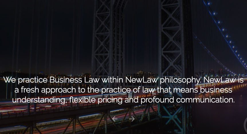
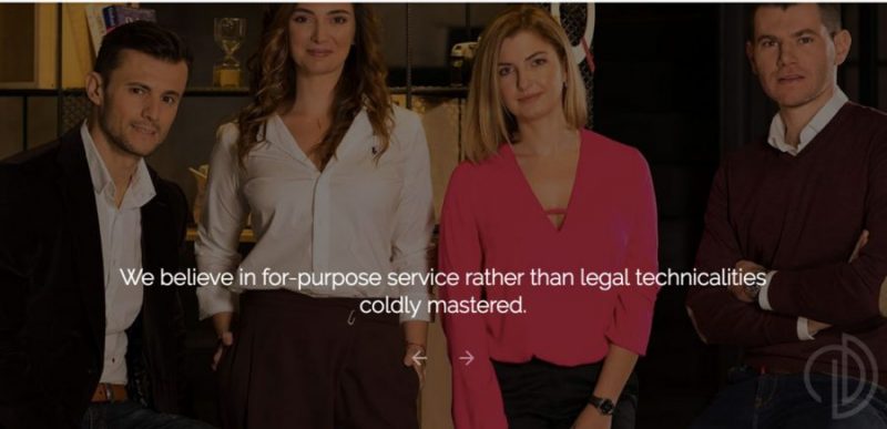
A small size lawyer house in search for their own voice on the market – apart from a job well done – happens to meet Innerout . Young and ambitious lawyers with a particular approach towards their clients needed guidance as regards the shape of their public promises.
But, as always, public promises should find their roots deep into the truth of the business. Which is why the truth of their business was well investigated through internal and external perceptional audit: employees, associates and partners alongside clients, old and new, as both internal and external representations about the business matter.
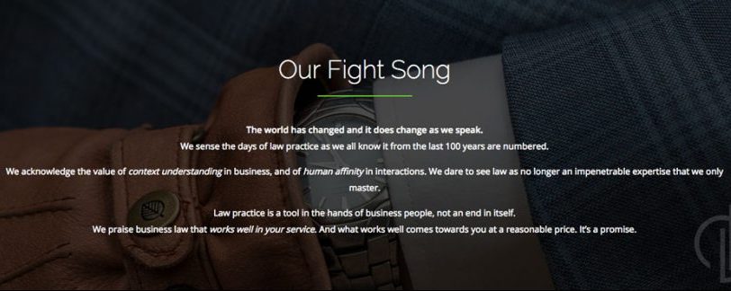
As a result of the perceptional audit, a common picture emerged: a small company with a fresh mentality embraced naturally a new positioning in what is called New Law. A fresh and iconoclast approach towards the practice of law whose principles are currently being defined worldwide, as a reaction to the 100 years of Old Law unchanged practice.
A new generation of lawyers with new approach towards businesses and life in general embraced a new brand rhetoric paired with a new visual identity talking about freshness, flexibility, agility and relaxed “humanity”. The business of law within the New Law frame is liberated from rigors talks naturally and initiates true dialogue with its clients.

Privileg
Privileg
Brand Audit / Brand Strategy / Brand Design / Internal branding
The company and its business challenge:
A Romanian entrepreneurship performing excellence in its field of activity (catering services for big events) proved to be rather understated when it came to self-presentation. Official supplier of the Royal House of Romania, with tens of happy and loyal clients sensed the need to harvest more of its potential through refreshment in its own yard, organizationally, rhetorically and visually.
As any brand conceptual journey starts with self-awareness, the company went through an extensive internal and external brand audit on employees and key clients, to dig for the authenticity core that would eventually be the backbone of future promises. What the audit revealed was an amazingly functional discrepancy between internal and external “realities” of the brand. The company’s capacity and willingness to satisfy high demands of clients was rooted in an internal relentless culture of effort. A lot of striving put behind high stake events, with little time for celebration of the results. As a result of this finding, an internal culture of recognition, thanksgiving and celebration was put in place in almost a year.
The design output
According to clients’ testimonials, the main asset of the company was the capacity to produce great taste in food, through passion for details and well-curated recipes. Hand made, clean and freshly cooked dishes, with a penchant for complex yet classical tastes, this was a highly appreciated mixture and the main reason feeding clients loyalty.
“Passion around perfection” as an own-able promise followed naturally as a signature.
Design wise, the exquisite proprietary dish received a superimposed aquarelle interpretation. So, a visual identity fresh in the category came out at the crossroads between the classic posture of a signature dish and a free, relaxed young-at-heart brush. It came out as the best way to picture taste, elegance, and freedom of expression.
Design credits: Foodwise



Envisia
Envisia
Naming / Brand Strategy / Brand Rhetoric / Brand Design
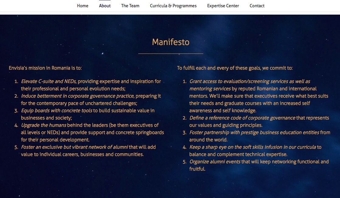
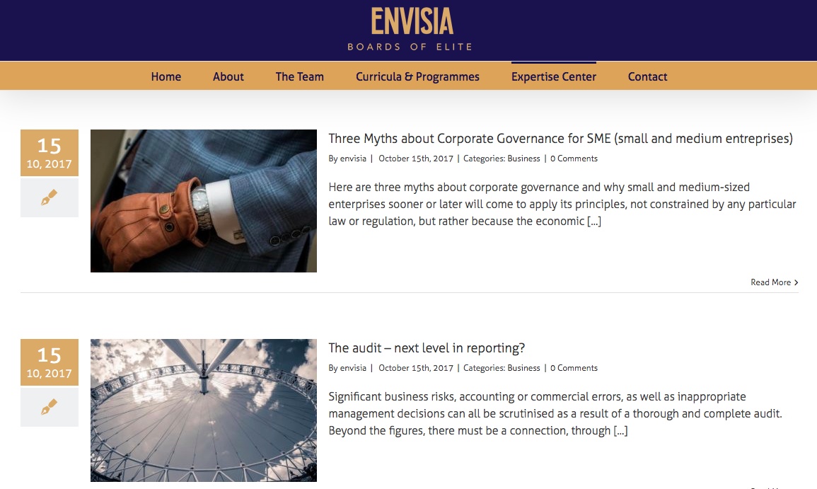
Envisia is a business of higher education for C-Suite and non-executive directors in Romania.
An initiative issued out of a need for a better technical expertise but also for better soft skills in the boards. Education for the business elite, delivered by the most reputed business mentors and developed within prestigious partnerships.
Innerout named this educational organization Envisia because of the large horizon that is comprehended by this name. The name stands for vision, communication and knowledge breadth: somewhat feminine, like its female entrepreneur initiators, but universal through its projection and promises.
Design wise, the identity builds upon the symbol of vision unified with a symbol for knowledge. A “mid-night” blue to contrast in a powerful statement with the glow of the symbol and to offer a graphically generous playground for the brand rhetoric. Special gold was chosen for exquisite printed materials. An elongated, elegant and intellectual type font to convey what education promises. Finally, a brand signature about “the power of the uncompromising”: “Boards of Elite”
From Manifesto to Values and to each and every word that composed the official rhetoric of the brand, the whole branding journey became complete and inspiring. Bright new future for the business elites!


Finesenza
Finesenza
Naming / Brand Strategy / Brand Rhetoric / Brand Design
Finesenza is the type of client and project that gives a sound challenge to any brand designer who restrains to thinking the financial expertise rather in terms of predictable graphic recipes.
A former big 4 highly skilled and specialized professional meets the entrepreneurship challenge of her life and the result is the need for a personal brand under a …brand new identity.
Finesenza came up as a name that stands for the essentials of finance, but in a subtly-daring-and-status-quo-challenging naming in the field. The undertone of feminine leadership fuels an essential rock solid expertise in auditing and advisory services.
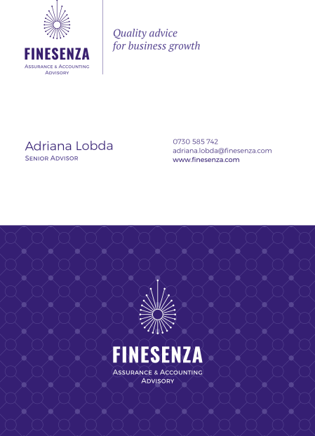
Step two is the brand designer to take the torch. At the core of the brand identity there is brain, intuition and a feeling of safety. Synapse and …people connectivity in the same time. There is the symmetry and predictability of the figures but delivered in a rather soft, harmonious and nuanced approach. The logo speaks about the hard power of the know how to penetrate towards solutions and in the same time of the soft, ineffable power of a lifetime gathered expertise. Pinpointing a solution through collaborative & smooth guidance, almost with delicacy. Elongated, intellectual font, filigree sign and a business-sharp color aggregate to build up a sense of “trust smoothly delivered”.
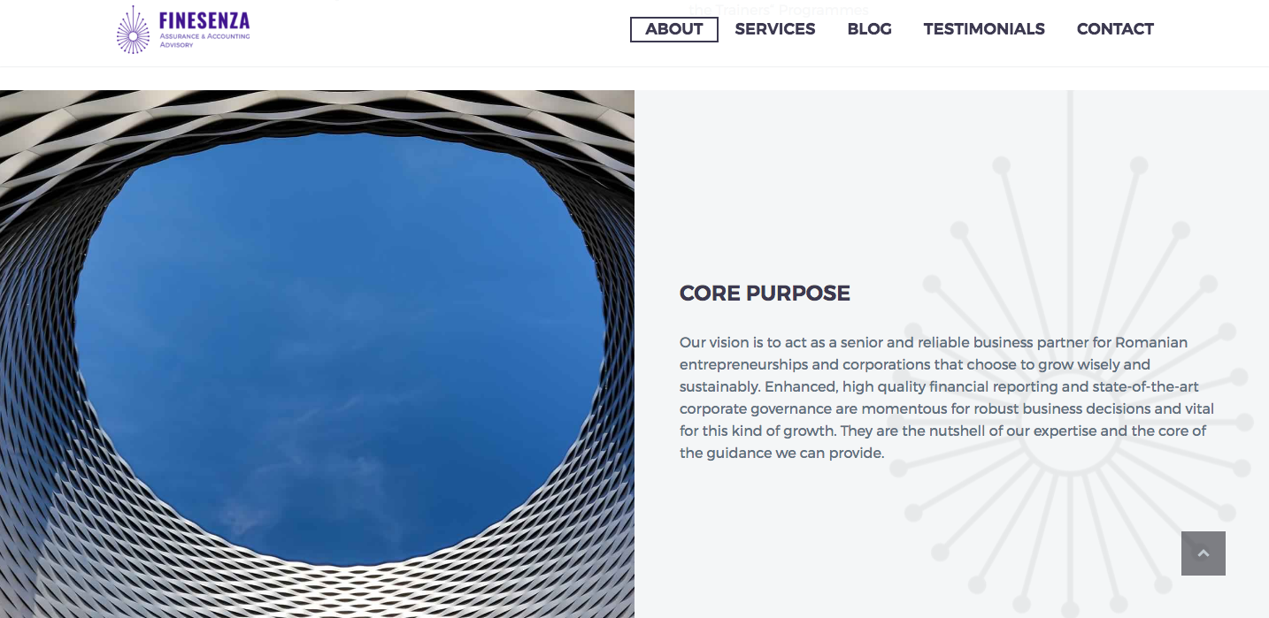
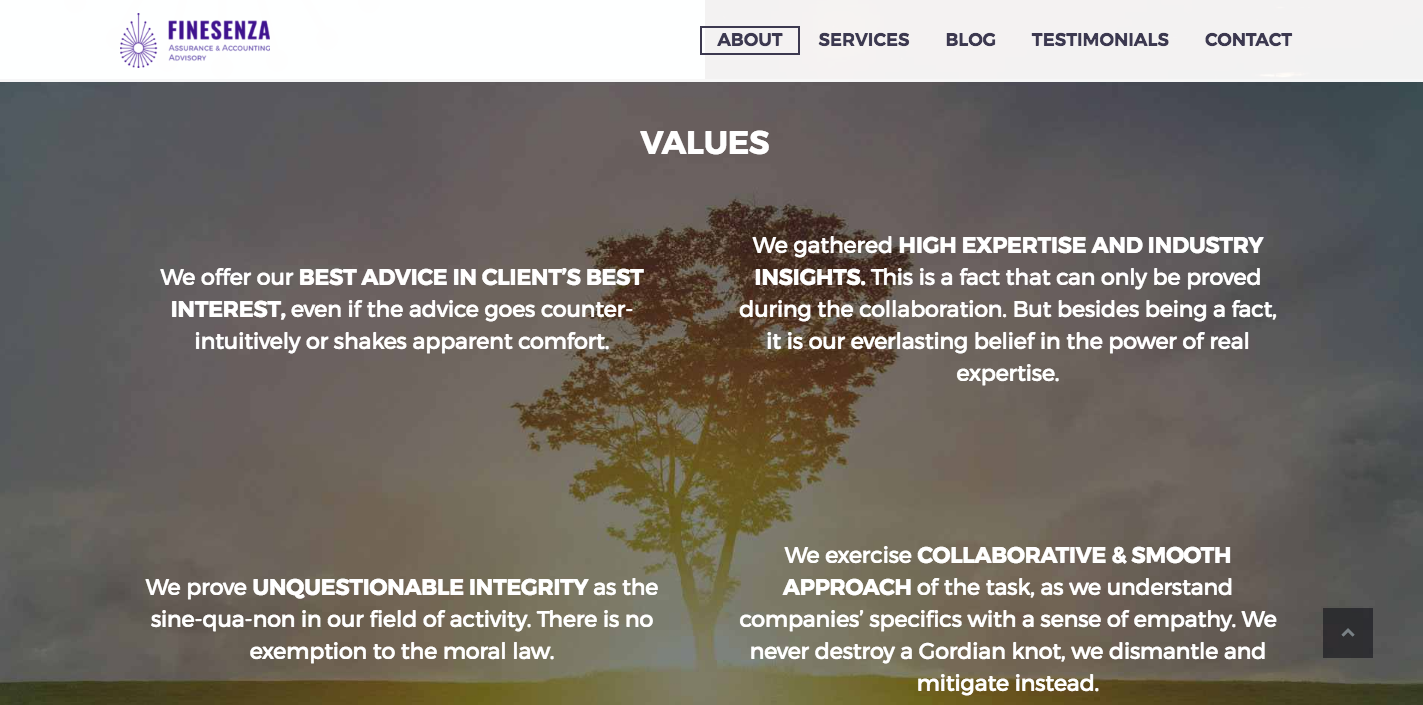
www.finesenza.com followed as the digital business card: a birth certificate for a successful business and fruitful future partnerships. For Innerout: just another project with good vibes all the way.
Design credits: Teodor Decu





Casa din Bran
Casa din Bran
Brand Audit / Brand Strategy / Brand Design
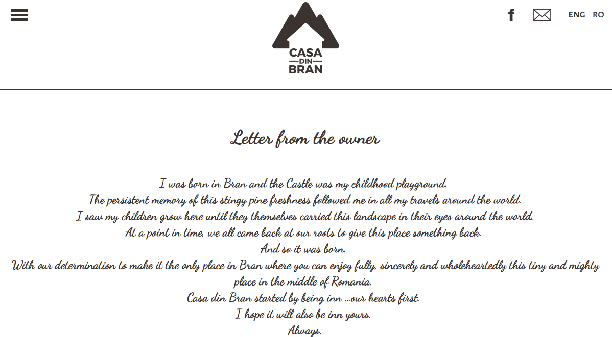
A nice and cozy accommodation in the middle of nature and in the close vicinity of Bran Castle was in for a rebranding. An inn in for refresh otherwise put. Owners were feeling that there was room for improvement in their permanently booked location, not so much in terms of refurbishment but rather in terms of modernization of their looks and upgrade of services.
From brand audit to positioning strategy, redesign and brand engagement session with employees, the whole itinerary revealed as rather picturesque.
The new visual identity in its whole simplicity and yet versatility captured inside the core values of the family entrepreneur: authenticity, integrity and a good sense of balance in life.
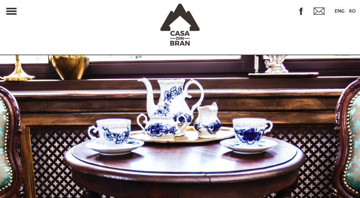
A noteworthy upgrade happened not only in the brand image, but also in the brand experience, there where the truth dwells in services brands. Yes, rebranding is not only about a fancy new logo, but about a consistent upgrade in the brand experience. Business consultancy provided created sound premises for an elevated experience of the tourists. The owners were admirably open to rethink internal procedures, reposition people, train them, make new hires and upgrade the quality of services sustainably, through an upgrade in knowledge for employees. Last but not least they proved willing to produce high quality promotional materials, from napkins to spoiling welcome gifts.
Next time you come in Bran, pay them a visit and see how deliciously wrapped the honey jar is. Or the lavender sachet that you receive at the reception desk. Or maybe the absolutely addictive signature dishes…
Design credits: Hippos Group




Wargha Enayati
Wargha Enayati
Brand Strategy / Brand Design
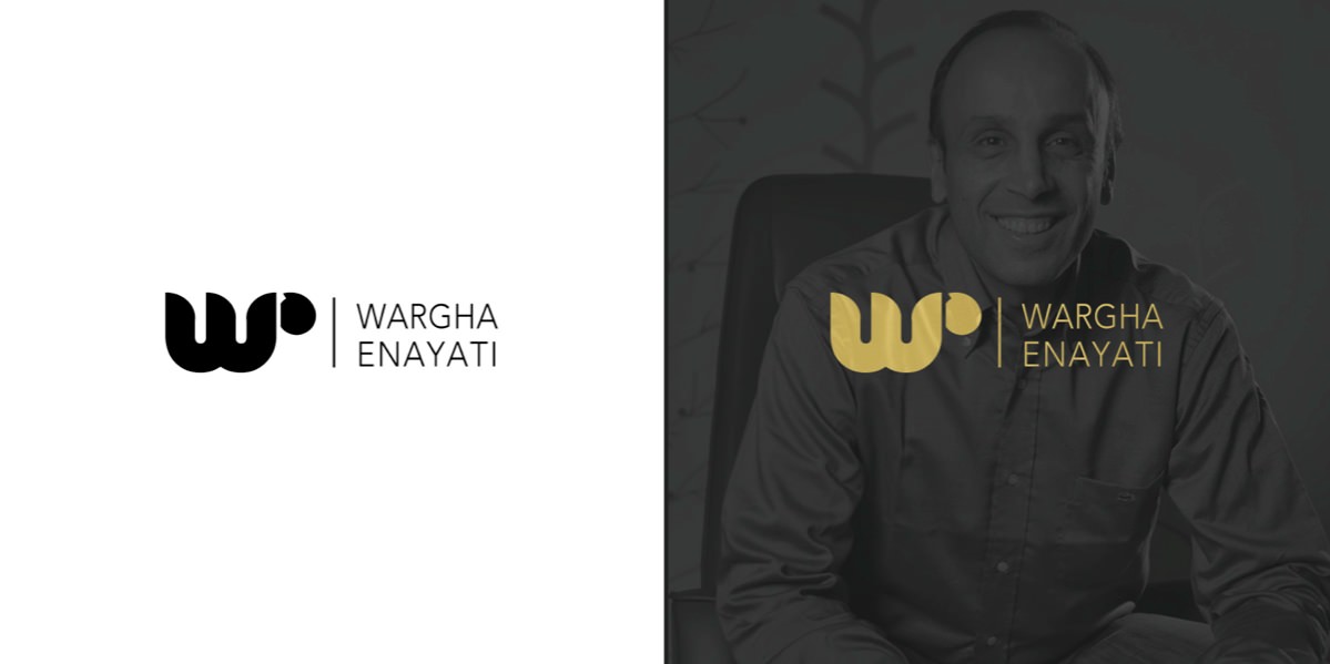
Wargha Enayati is a well-known entrepreneur, founder of the first Private Healthcare Network in Romania, Regina Maria.
A cardiologist, a social entrepreneur and a highly spiritual person, Wargha Enayati’s human and professional profile stood as a model for several generations and inspired a culture of heart-rooted values in his businesses.
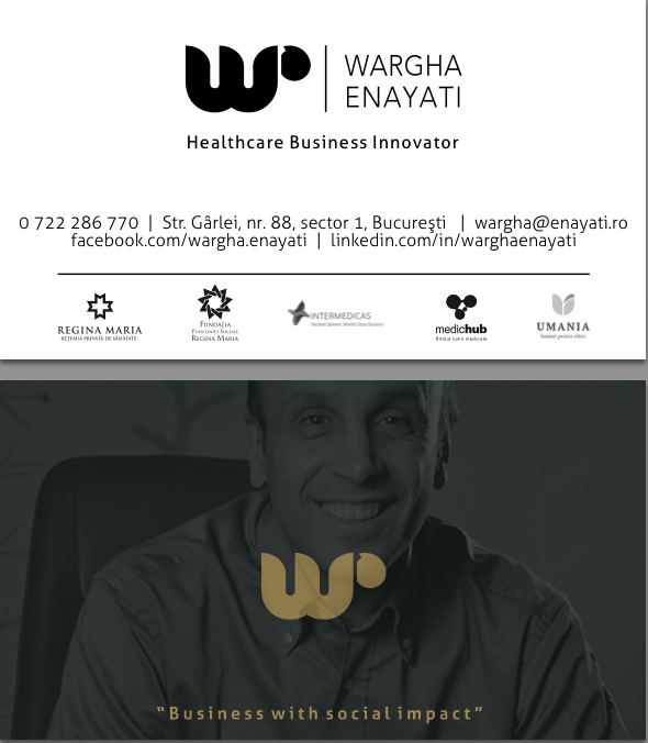
The exit from Regina Maria found the entrepreneur at a certain crossroad of opportunities and in the same time in a search for a professional descriptor that would potentially harness the DNA of all his future businesses. With so many projects ahead, his candid question of “now what should I write on my visit card?” came as an irrefutable challenge.
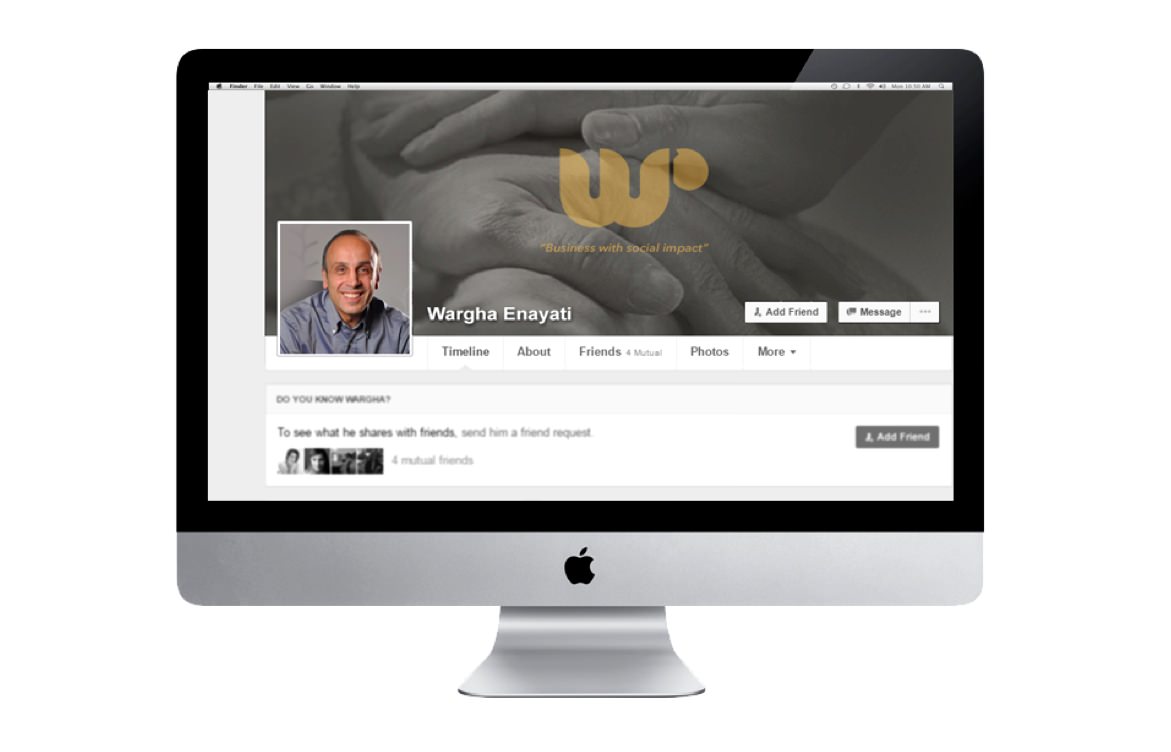
What Innerout did was to put his human profile in a strategic path of communication. The personal brand strategy led almost logically towards the new descriptor of the brand – not new in itself, but finally stated as such: “Healthcare Business Innovator” appeared as the shortest possible expression for a complex character and for an even more ambitious brand promise: “Business with Social Impact”.
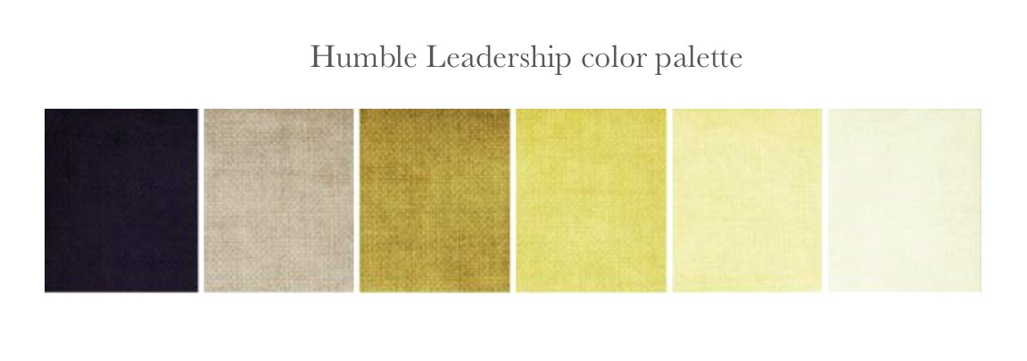
The identity design talks about a double metaphorical vicinity: a speech bubble as a symbol for an impactful statement made to the world and in the same time a subtle reference to the Baha’i rhetoric universe, so intimately attached to the name. The entire tone of voice of the brand is placed under the aura of a Humble Leadership. The only leadership of the future, actually.


Life Up
Life Up
Naming / Brand Strategy / Brand Design / Brand online implementation
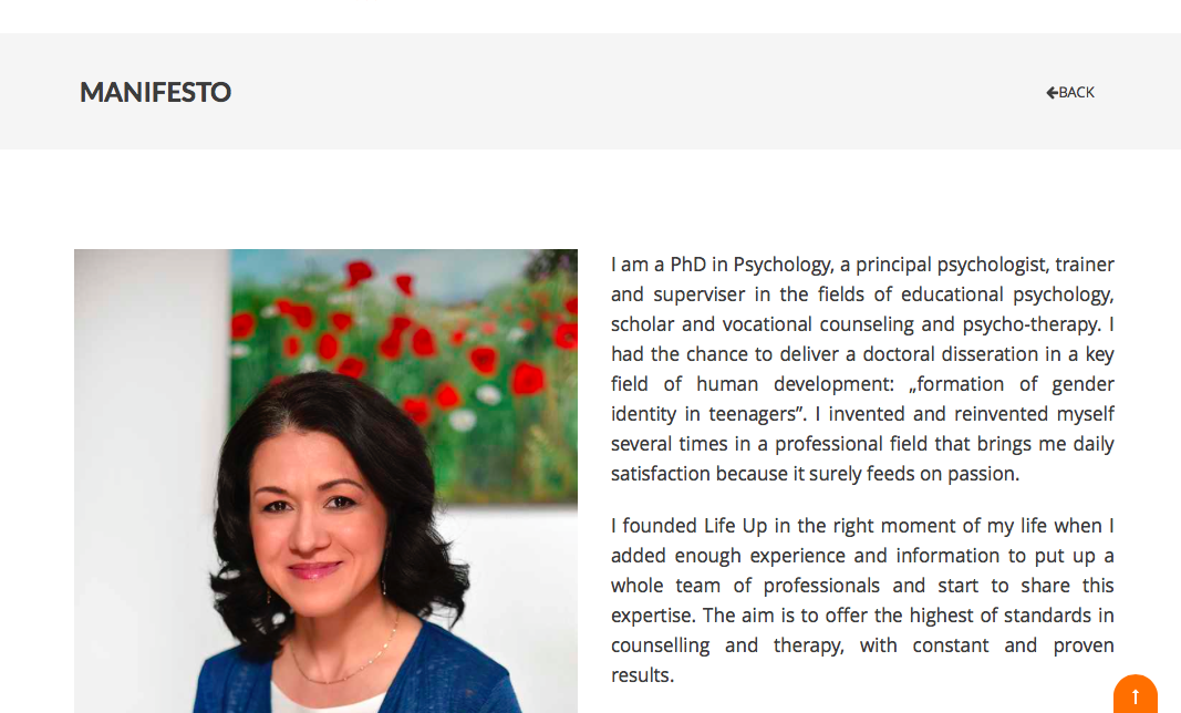
A PhD in psychology of education walks in one day and asks if you can help her put together in a clean and simple shape all that she learned and taught for a life in her courses and in her own practical experience with patients and clients in the field of Psychology of Education. Books published, a consistent contribution to the academic literature in the field and an impressive CV, they all unfold in front of your eyes.
Where to start from?
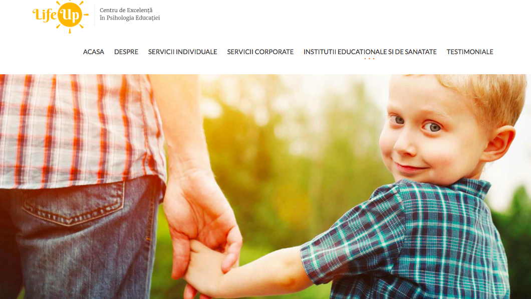
The first step was to give a simple name, universally intelligible, clean and memorable (and luckily enough still own-able, IP wise) to a rather complex domain and then translate it in a design shape. A simple, vibrant, luminous identity came out, as a solar encapsulation of the concept of LLL (Life Long Learning), which is the substance of the entire teaching and coaching approach of the client. A nice and friendly presentation site with its entire structure and bilingual rhetoric shaped as to clarify fields of expertise and make the owner’s knowledge available to her stakeholders.
Great interaction and Life-Long-memories…
Site: www.lifeup.ro
Design credits: Teodor Decu





Alexe Lawyers
Alexe Lawyers
Brand Design / Brand Strategy / Brand Rhetoric
The lawyer brands are a generous playground for designers, despite the apparent rigors of the field. As a matter of fact the very etiquette in this domain is inviting and intellectually challenging.
Alina Alexe, the entrepreneur in question, came with the need to articulate her own voice in her field of expertise and also to gain a clear digital profile that would represent her professional credo – her own and her team’s.
The human fabric that stands behind the brand identity is empathetic, elegant, profound, introspective, thoroughgoing and not very assertive. Her promise revolved around the idea of a wise and balanced attitude in life and litigation, rather than the incisive and vocal approach of the domain.
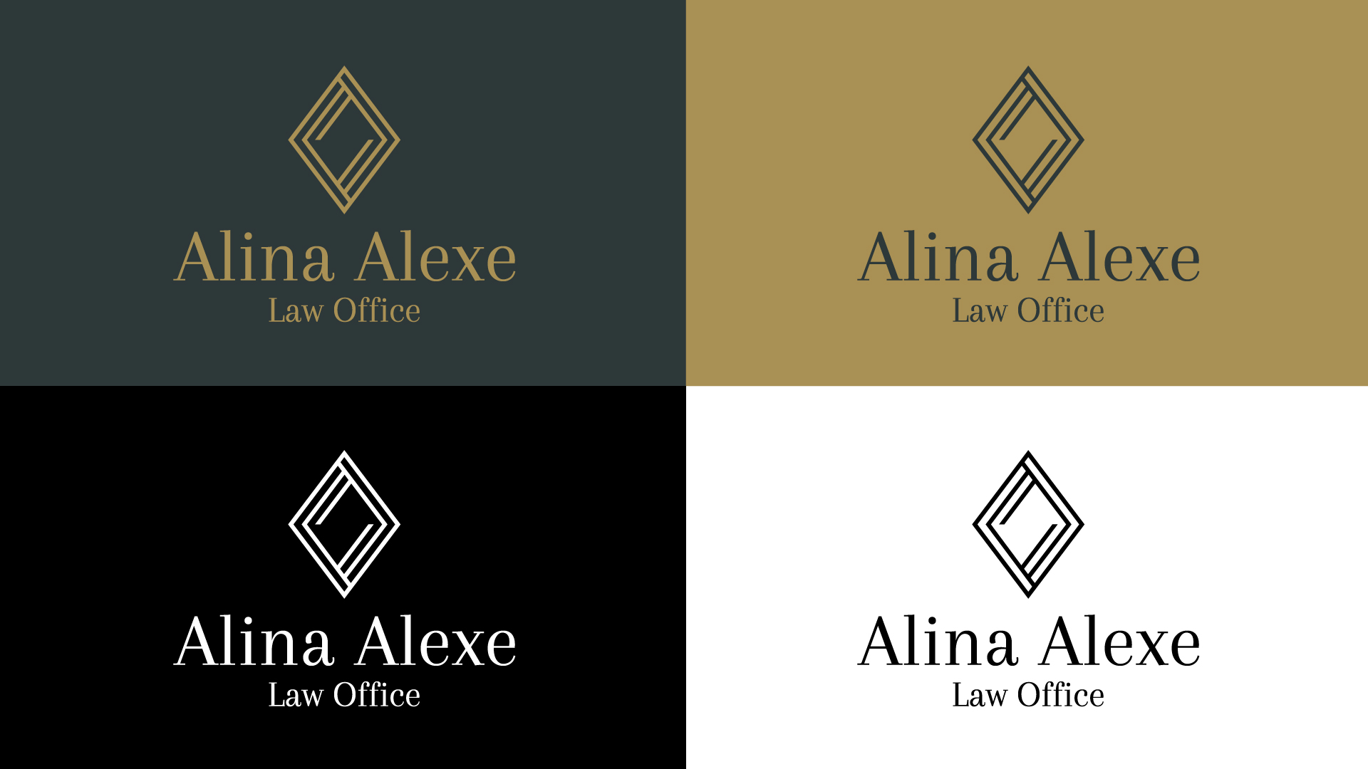
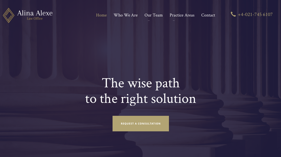
An elegant brand identity came out of a process that distilled the promise of “The wise path to the right solution”. The sign captures inside the mirroring of the name initials the idea of a good balance, an empathetic reflection of the client and in depth investigation. A comprehensive and complete story encapsulated and delivered elegantly, wisely, relaxed.
Site: www.alexelawyers.com.
Design credits: Teodor Decu