
ID Therapy
ID Therapy
Brand Strategy / Brand Design / Brand Platform / Naming
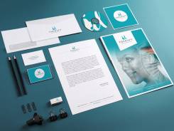
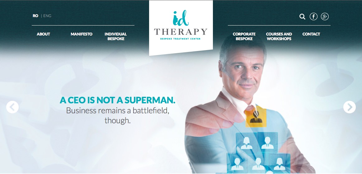
The entrepreneur: a so-called “multipotentialite” human entity. EMBA, Medical doctor and psychotherapist with a reputable corporate management expertise in medical field and countless of certificates from couple therapy within Gottman Institute to Facereading courses and Virtual Therapy platforms.
The challenge of such an entrepreneurial profile comes from the hardship of choice, as the owner did not want to give up any of her acquired expertise and yet deliver a single-minded value proposition around a core competence.
The strategic approach was not a reductionist one, as strategy usually imposes -choose a promise and sacrifice alternatives – but based on an inclusive, common denominator of all the fields of expertise. The result went out as a fresh, relevant and sustainable entrepreneurial brand, built around the personal brand of the founder.
Verbal and visual identity, brand strategy and positioning, brand rhetoric, from A to Z. Design credits: Lavinia Plohod.



Foodwise
Foodwise
Brand strategy / Brand Design
Foodwise is a clear example of how well objectivity works in the communication industry. Although they are an advertising company with lots of branding projects in their own portfolio, they never thought of a positioning for themselves the way they advised their clients to think of. They had the knowledge, they had the credentials and a team in place but no brand to gather all these in a coherent internal and external statement. From the client perception audit – as the ground zero for any rebranding process – to a clear descriptor and a sharp rhetoric, the whole process was a rewarding two months back-and-forth of ideas and sharing.
The result: a clean promise, a nice looking brand, rhetorically authentic and sustainable. Last but not least an occupied territory of competence in the industry that caught the attention (and the budgets) of existing and new clients. May Foodwise live long and happy, business-wise! Credits: Cristina Diaconescu-Pirlitu (graphic design).


Qualitance
Qualitance
Brand Strategy / Employer Branding / Brand Design
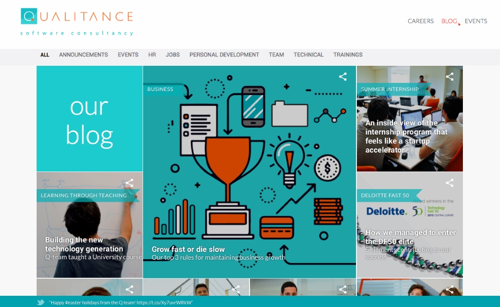
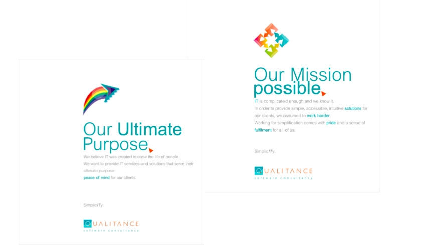
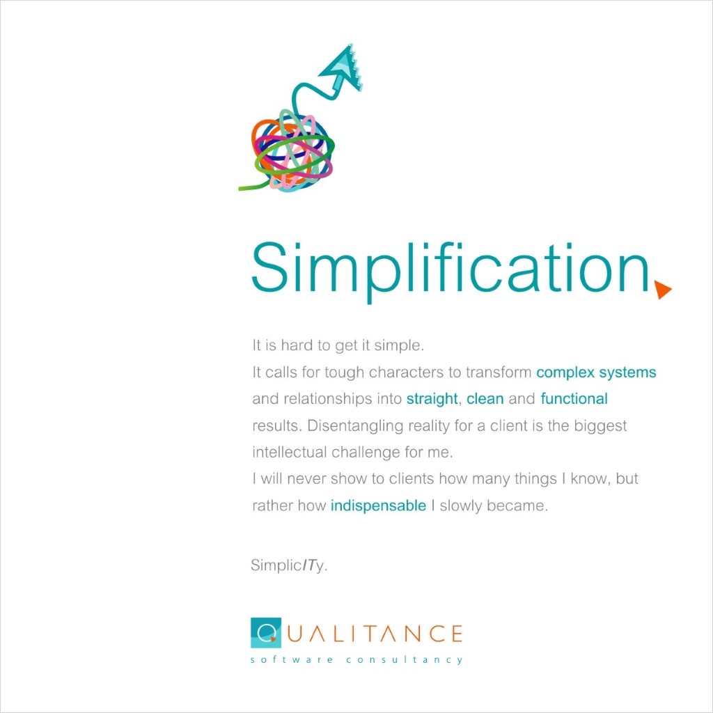
In 2013 Qualitance QBS was a technology company with an impressive portfolio of clients, a young talented team and a visionary and charismatic management, entrepreneurial in style. What was missing in this landscape was the very definition of their brand: an unconvincing visual identity and a software consultancy unaware of its role as a software consultancy were at the starting point.
What Innerout did was to define the backbone of this entrepreneurial company on its half way towards becoming a global corporation in technology, from brand identity design to brand platform definition and internal brand engagement sessions with all employees.
Nowadays, Qualitance skyrocketed its presence on 3 continents and they now “help clients from top 500 Fortune companies innovate”, as they put it. Maybe the clarification of their brand at the beginning had its tiny contribution to a splendid evolution, who knows?

Iconic Health
Iconic Health
Brand Strategy / Brand Design
The entrepreneur and the business
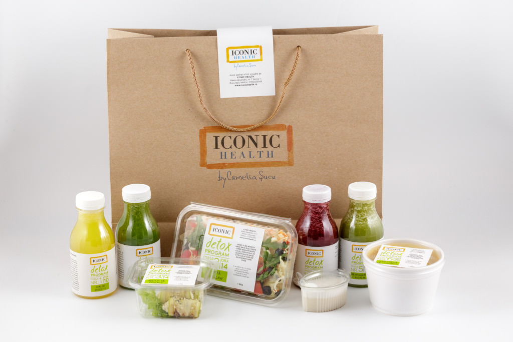
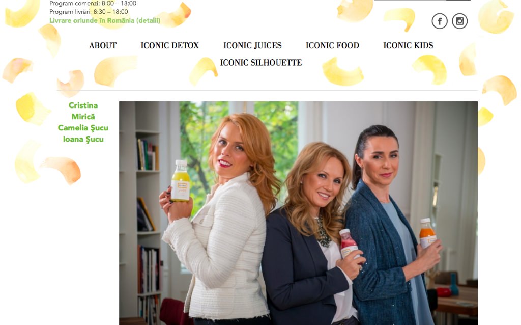
Camelia Sucu is a serial entrepreneur in the field of furniture design and healthy lifestyle concepts whose journey in personal branding was managed by Innerout in the last few years. Iconic Health Program by Camelia Sucu was born out of a visionary outlook on life: “I want to inspire people to live a more balanced life and choose a healthier food, not only by giving advice but also concrete alternatives”. A family business made by mother (medical doctor and entrepreneur), sister (nutritionist, the brain behind the recipes) and daughter (project manager) started it all in an experimental manner, but evolved towards massive presence in biggest retail.
It took shape as a coherent business promise once it got a brand positioning and strategy, brand architecture, a visual identity and the entire set of brand manifestations derived from this nutshell. Credits: Ghica Popa (graphic design).


Sega Flores
Sega Flores
Brand Strategy / Brand Design
There is this talented young lady that comes at your door and says: I’ve been making beautiful floral arrangements since I can remember, but I want to be more than that. I want to grow a business like I grow my own pot flowers. And so it began.
A business built around a special knowledge and nurtured by a lifetime passion needed an appropriate visual and verbal expression to face the world. The B2C floral market is maybe the most cluttered and unregulated, still opportunities are rich in the B2B area.
A crisp and invigorating brand signature sprung right from the heart of a promising positioning. “Fresh for business” delivered together with a silky decorative visual identity and a brand platform that clarified the path and the business decisions to the owner proved to be a functional conceptual cocktail. A brand new business, fresh for business …to business. Credits: Lavinia Plohod (graphic design).


DC Catalyst
DC Catalyst
Brand Strategy / Brand Design / Naming
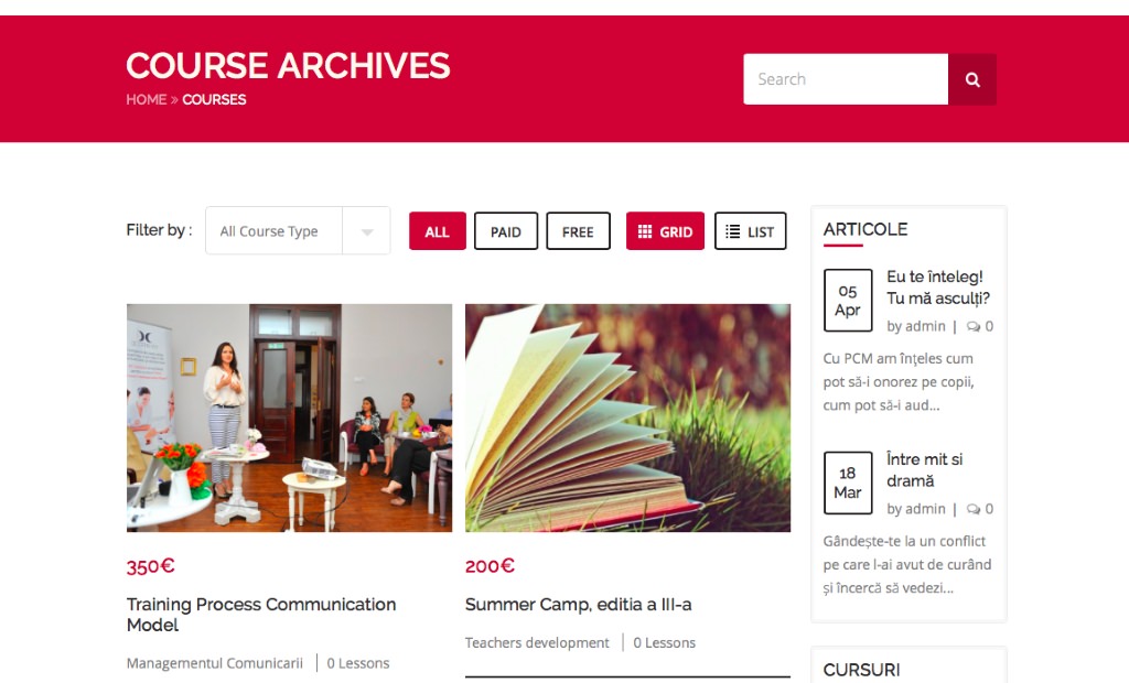
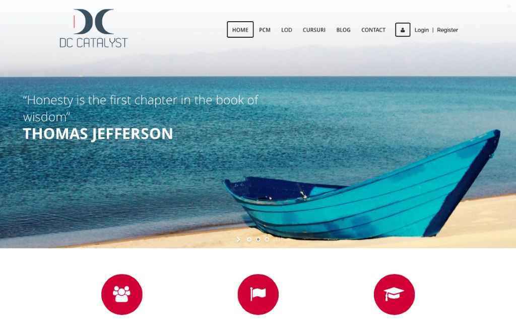
A psychologist and trainer of PCM (Process Communication Modell®) and LOD (Leading out of Drama ®) who gathered around a team of trainers and developed a series of great business ideas were in search of a branding approach to help them make a disciplined business proposal to individuals and corporations and actually monetize their knowledge.
DC Catalyst was born as a coherent business strategy first, and then as a brand articulation. Naming, positioning, brand platform, and complete rhetoric took shape and molded back the business. Branding and business proved once again to function synergistically and determine each other. Branding is a strategic management tool and the best manifestation of the design thinking paradigm in business, we will never rest from saying it. Credits: Ionut Popescu (graphic design).

Alisia Enco
Alisia Enco
Brand Strategy / Brand Design
Beautiful projects start in the mind of beautiful people. A serial entrepreneur who already developed two successful businesses before turning 30 started the third, inspired by an insight from the previous. The founder of Women in Business networking platform sensed an opportunity to cross-feed the same audience with another business solution.
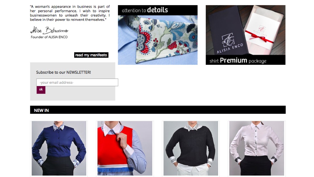
The entrepreneur and her igniting insight: Her observation was that women in business tend to dress in conformity and uniform-ity. Why not coming up with an online fashion retail centered on the most iconic piece of a women appearance in business, the almighty shirt, reinvented?
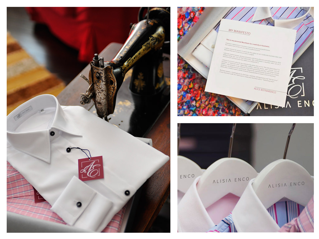
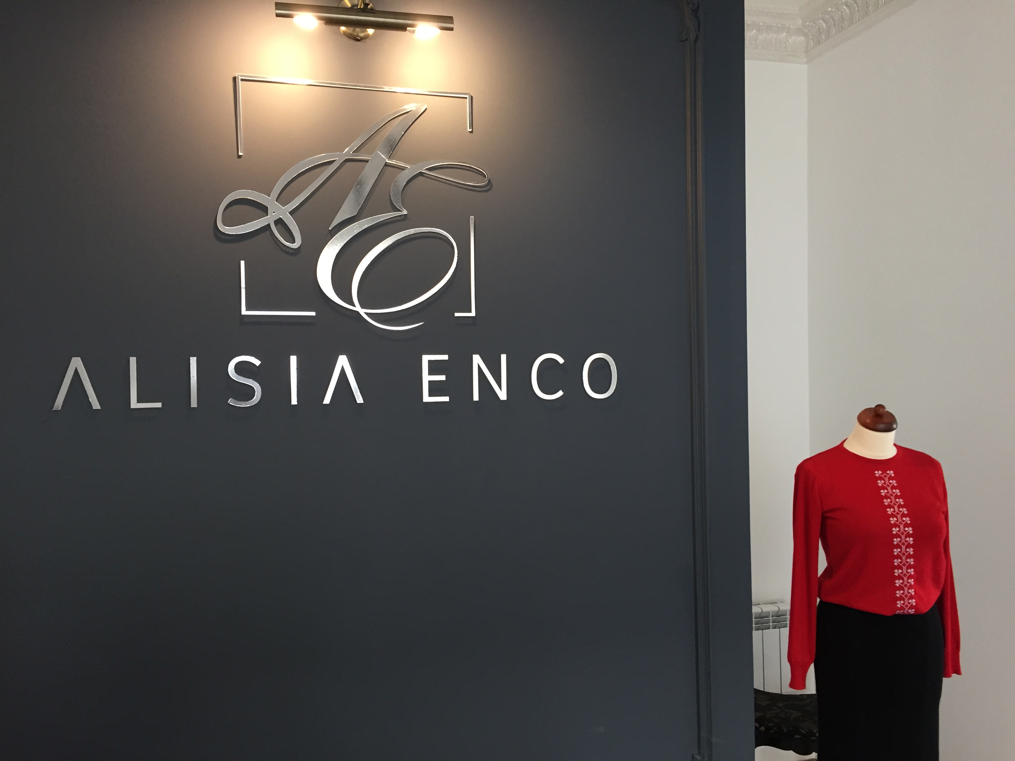
The solution: Alisia Enco, playful and memorable twist on the founder’s name, stood at the origin of a clarifying brand platform and daring manifesto around creativity in business. Brand design, strategy and rhetoric, all wrapped to deliver a delightful brand experience. Credits: Lavinia Plohod (identity design).

Upperself
Upperself
Brand Strategy / Brand Design / Naming
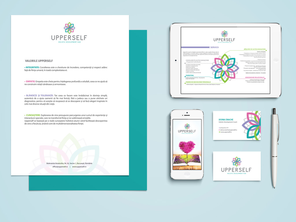
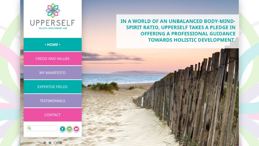
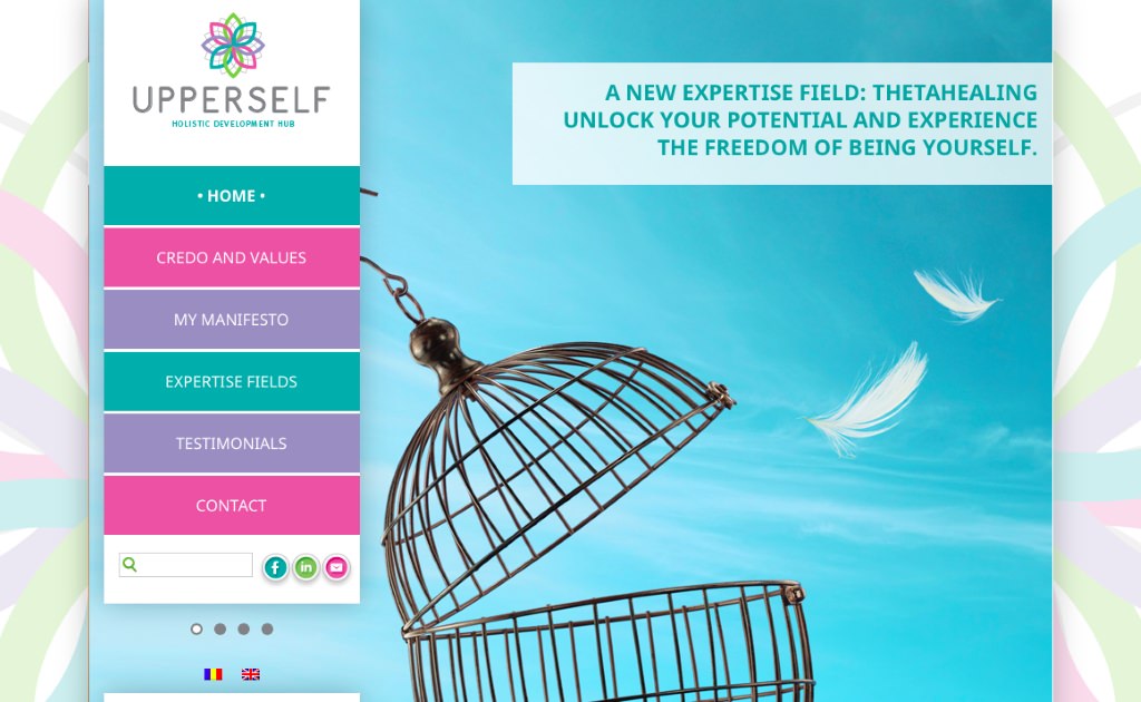
The context: Upperself is among the most challenging projects for a brand consultancy because of the nature of the business behind. What can a brand consultant do when the subject of a the consultancy is a highly endowed and spiritual being, specialized in numerology and alternative therapies who wants to convey to as many people as possible a message of personal development through spiritual growth?
The approach: The consultant starts by giving a name to this endeavor and then vertebrates piece by piece a business promise towards all the potential stakeholders. The field of spirituality has evolved in the recent years at a pace like never before, going hand in hand with the need of holistic healing in people. Nonetheless, the same domain continues to be a subject prone to stereotypes and superficial labeling. The brand managed to craft a voice of its own in this field through strategic positioning, great naming, beautiful identity design and clean wording. Credits: Lavinia Plohod (identity design).

NN – Natural Nutrition
NN – Natural Nutrition
Brand Strategy / Brand Design / Naming
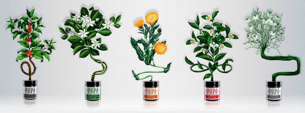
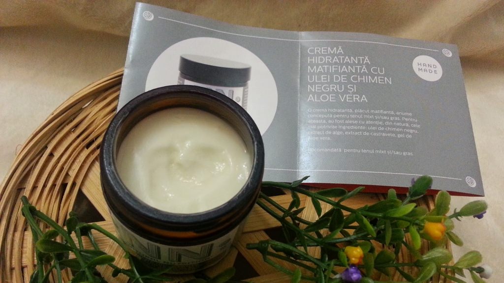
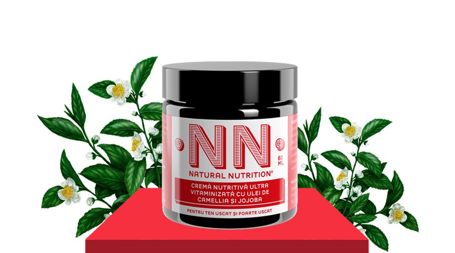
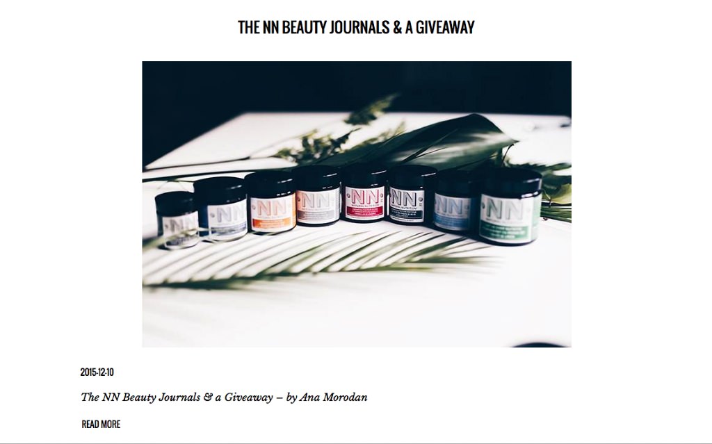
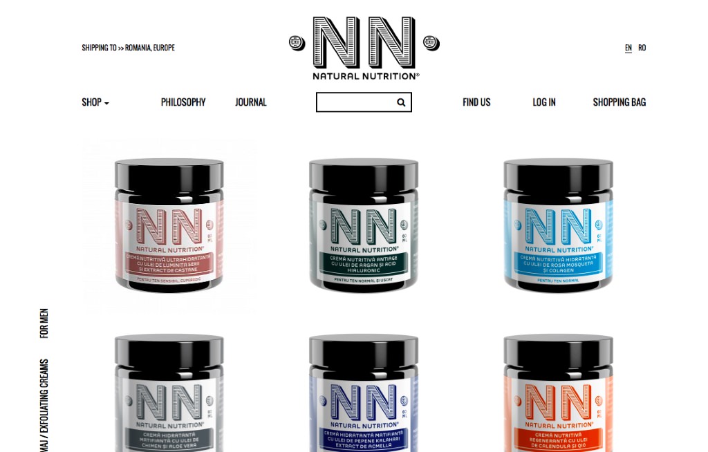
The story: Natural Nutrition is a business that was born out of a passion, but with a true and charming story behind. The 60 years old daughter of an 80 years old pharmacist decided to revive the beauty recipes of hand made crèmes with natural ingredients made by her mother, in the contemporary era of pre-fabricated beauty.
The challenge: The brand needed a verbal identity and a red rope of conceptual flawlessness. The journey started with a name that came out as effortlessly as the product itself: playing with the already classical BB and CC generic category denominations, the idea of “NN – natural nutrition” appeared as a clean descriptor for an authentic reality. It then continued organically with a brand platform that clarified the mantra of “never putting on the outside of your body what you wouldn’t gladly put inside” that was virally taken over by opinion leaders and spread …naturally. A natural journey in itself, briefly put. Credits: Paul Dersidan (design), Paul Duta (illustration).
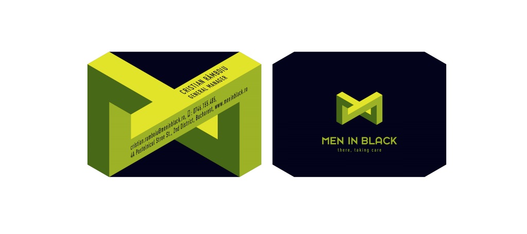
Men in Black
Men in Black
Brand Strategy / Brand Design / Employer Branding
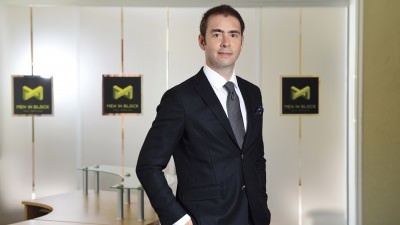
The context: A below the line advertising company specialized in field marketing activities with a 20-years-ago own visual identity and unclear message towards their clients. The need for refreshment was both external and internal, towards employees.
The project: it started right with a perceptional audit of both clients and employees. Almost 20 in depth interviews carried one to one to unlock the inner truth of the company and clarify the assets in front of its most important stakeholders. What followed was a total refresh of visual identity, a new promise within an unchartered positioning territory and a successful internal engagement program with all the employees. “There, taking care” proved to remain a bold and well sustained statement from a B2B company meant to supply trust and wipe any field implementation stress off their clients’ brains. Design credits: Paul Goti.